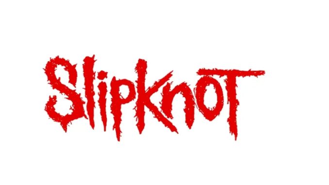
Joey Jordison’s Original Slipknot Logo Sketch Is a Metal Masterpiece — And Fans Are Calling It “A Treasured Piece of History”
Slipknot fans were treated to a rare and emotional piece of band history this week as an original sketch of the iconic Slipknot logo — hand-drawn by founding drummer Joey Jordison — was revealed by his family. Posted to an Instagram account “created by the family of Joey Jordison to celebrate his life and legacy,” the image showcases the raw, initial design of what would become one of the most instantly recognizable logos in heavy metal history.
Joey Jordison, who tragically passed away in 2021, was not only the rhythmic powerhouse behind Slipknot’s chaotic and thunderous sound, but also a key creative force in shaping the band’s visual identity. The original sketch, featuring both the full Slipknot logo and the now-famous ‘S’ symbol, looks strikingly similar to the version still in use today. That fact alone is a testament to Jordison’s artistic instinct and vision — and a reminder of his deep connection to every aspect of the band.
A Sketch That Became Legend
There’s something profoundly inspiring about seeing the humble origins of a logo that would go on to define a generation of metalheads. Much like Paula Scher’s iconic Citi logo, famously doodled on a napkin in a client meeting, Jordison’s sketch proves that timeless design doesn’t require fancy tools or expensive software. His use of what appears to be Tippex (white correction fluid) to adjust elements on the paper adds a gritty charm — proof that imperfection often leads to authenticity.
The detailing in the letterforms is particularly striking. From the angular cuts in the ‘T’ to the fierce curvature of the ‘S’, every element of the design feels intentional — raw, chaotic, yet undeniably balanced. You can almost feel the energy and intensity Jordison poured into this creation, channeling the same spirit that defined his drumming.
Fans React With Emotion and Gratitude
The reaction from fans has been overwhelmingly emotional. One Instagram user commented, “You can tell Joey was the heart and soul of the band,” while another added, “Dude was a lowkey graphic designer.” Perhaps the most poignant remark came from a fan who wrote: “A treasured piece of metal history right there! So cool. RIP Joey.”
In the world of band logos — where branding often feels corporate and disconnected — Slipknot’s visual identity has always felt like it came from the inside out. That’s largely because it did. Seeing the original sketch reinforces the authenticity of Slipknot’s roots. This wasn’t a logo cooked up in a marketing office. It was born from the mind of a passionate musician, sitting down with pen and paper and building a vision.
Controversy Over Logo Changes
This isn’t the first time the Slipknot logo has generated buzz online. At the end of 2024, fans noticed that the iconic ‘S’ had been altered for a limited edition line of T-shirts. The new version was noticeably different — more vertically elongated, smoother, and lacking the jagged aggression of the original. Unsurprisingly, it was met with backlash from longtime fans who felt that the new design stripped away the raw energy and identity that Joey had infused into the original.

That controversy only adds to the impact of the newly revealed sketch. It’s a reminder that design is more than aesthetics — it carries meaning, memory, and emotion. When fans see the original design, they’re not just seeing a logo. They’re seeing Joey. They’re seeing Slipknot’s origin story.
A Legacy Preserved
For those who want to explore more of Joey Jordison’s visual art, the Joey Jordison Family Instagram account is quickly becoming a treasure trove. Alongside the main logo sketch, the family has shared other early designs, including the first iteration of the tribal ‘S’, which Joey famously carved into a desk before formalizing it into a logo.
The page not only serves as a celebration of Joey’s contributions to Slipknot but also as a heartfelt memorial to a deeply talented and multifaceted artist. From music to design, Jordison’s legacy continues to resonate — not just in the hearts of Slipknot fans, but across the broader world of metal and alternative culture.
As time goes on, few band logos manage to hold onto their original power and meaning. But Joey Jordison’s Slipknot logo — a sketch on paper, raw and real — reminds us that when art is born from passion, it becomes timeless.
And in this case, legendary.

Leave a Reply